Medicamentalia behind the scenes (part II - development and design)
This is the second post of a serie about how we made Medicamentalia.org, a global investigation about access to essential medicines that won the ‘Best Investigation of the Year‘ (small newsroom) in the Data Journalism Awards 2016.
Finding data
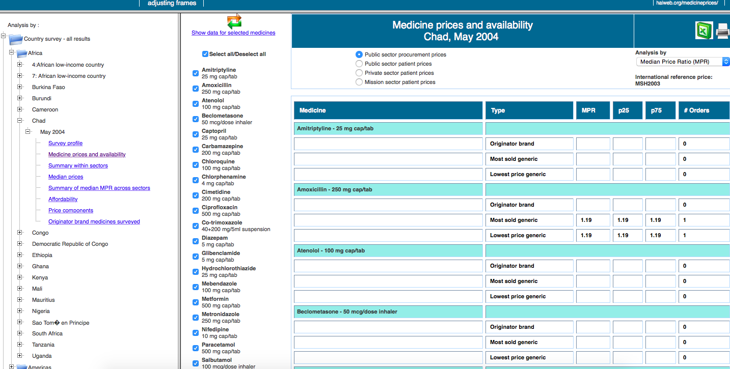
As explained in the previous post, the database of medicine prices in developing countries created by HAI is a great source, but it was available only in their website, as a set of web pages with complex navigation. We scraped the data using Ruby and Nokogiri, and released both the code and the resulting data as CSV.
Scraping, clearing and analysis
We then analysed the data, calculated trends and detected outliers using both Excel and PostgreSQL. We then filled the gaps, cleaned, restructured and checked all the data, either automatically or manually. That way, we had set our base camp: we had data from 56 countries for 14 essential drugs. We also added new countries (Argentina, Germany, Italy and Spain) using data we collected manually via FOI requests and web research, since our goal was to compare prices in developed vs developing countries.
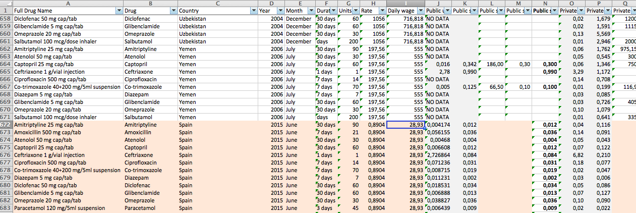
The final dataset can be downloaded here
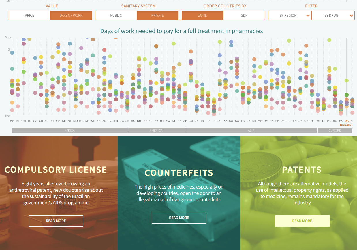
Data visualization
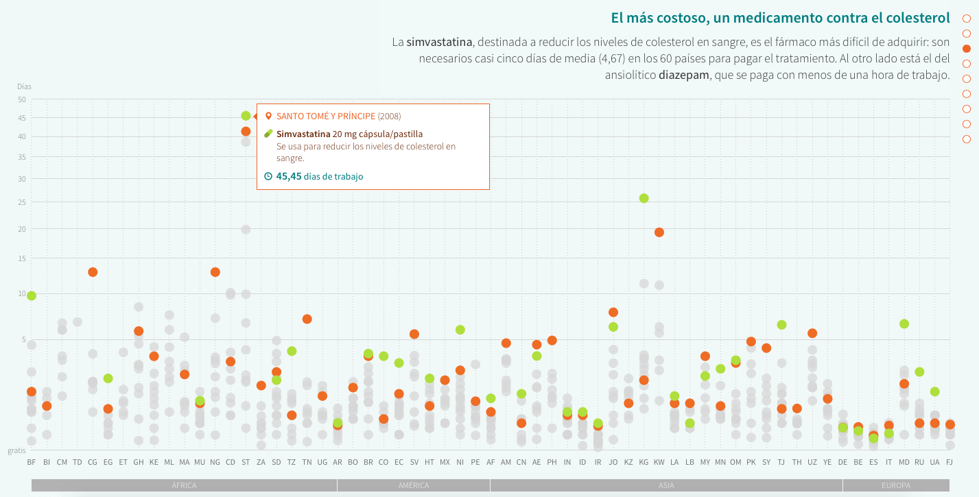
The visualization –custom developed in D3.js– is a core part of the project, and allows reader to explore the full dataset, comparing countries using different filters and criteria. But we are aware of the importance of leveraging data visualization as a storytelling tool: that’s why we initially guide readers through the chart, highlighting different findings and insights as they scroll down.
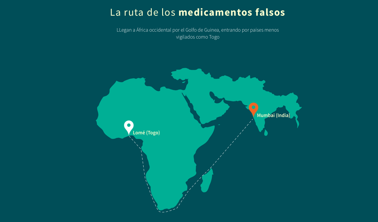
Similarly, the illustrations -created specifically for the project to explain how counterfeit drugs are smuggled into Africa and how the patent process works- are not static: instead, the SVG drawings, created by a professional illustrator, are animated as the reader scrolls down to better explain the story.
About the resulting web site, where we show the results of our work, it uses WordPress at its core, with a custom theme developed by us on top of Sage, based on Bootstrap. We paid particular attention to the UX (providing context to the reader when reading the long articles), to the mobile experience (the data visualizations, the illustrations and the videos, all adapt to the browser width) and to accessibility (the videos are fully subtitled in both English and Spanish).
Finally, to encourage reuse and increase the impact of the story, we published our work as Creative Commons and made our charts embeddable (with or without the storytelling), so it could be reused by other media, as La Nación (Argentina) did here:

You can find the web source code here. The people that developed and designed this project were:
- Raúl Díaz Poblete. Developer. Web development, user interface design and data visualization.
- David Cabo. Developer. Data scraping, clearing and analysis.
- Antonio Guzmán. Designer. Web design and illustration.